

To better understand the progress of work within your workflow system, you need reports that help you better visualize your entire workflow. The cumulative flow diagram (CFD) is one such report because it provides a graphical representation of the flow of work over time through the different stages of your project. In this article, we will explain what the Jira Cumulative Flow diagram is, how it works, and how to create highly informative cumulative flow diagrams using Power BI’s pre-built template.
What is a Cumulative Flow Diagram in Jira
A Cumulative Flow Diagram (CFD) in Jira is a valuable report for agile teams to monitor the progress of work items within a project sprint. The CFD takes its roots from the Kanban system, and it helps teams track the flow of work through different stages of the workflow process, allowing them to identify potential bottlenecks and disruptions. CFDs also offer predictive capabilities, allowing teams to forecast the future progress of their sprint or project.
By analyzing the cumulative flow of work items, teams can identify patterns and trends that may indicate potential issues in the future. This early warning system enables teams to proactively address problems and adjust their workflow, ensuring smooth progress and timely delivery of work items.
Additionally, the Cumulative Flow Diagram promotes transparency and collaboration among team members. Visualizing the progress of work items, CFDs foster a shared understanding among team members and facilitate effective communication. Team members can identify dependencies, blockers, and areas for improvement and collaborate to resolve issues and keep the work flowing smoothly. It promotes a collaborative and efficient work environment where teams can work together toward achieving their sprint or project goals.
What does a Jira Cumulative Flow Diagram show
A Cumulative Flow Diagram in Jira visually represents different stages of the workflow using color-coded bands on a chart. The vertical axis shows tasks in each stage, while the horizontal axis represents time. The CFD is primarily used to track metrics such as work in progress, work completed, and backlog, which can help identify bottlenecks and disruptions in the workflow process.
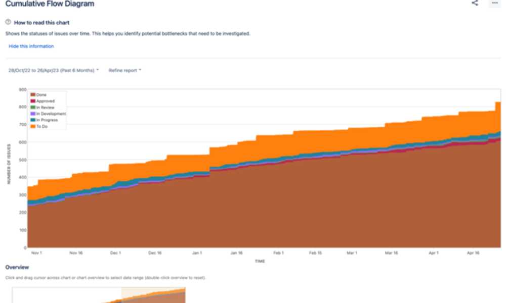
The Cumulative Flow Diagram is accessible through the Board menu of the project, where users can customize the report by applying specific filters or selecting different timeframes. The CFD is unique to each board and reflects its saved filter and column mapping. This diagram aids in tracking the movement of issues through the different columns of the board, helping users identify which columns accumulate more issues than others. As the issues move from one column to another, the CFD adjusts to provide an up-to-date representation of the work status.
The CFD is a valuable tool for tracking the efficiency of the workflow process. It can provide insights into blockers and disruptions that may be affecting the progress of tasks. By analyzing the chart, teams can identify areas that need improvement and make necessary adjustments to optimize the workflow. For example, if the bands on the chart widen, it may indicate that the number of uncompleted tasks increases, suggesting a bottleneck. Teams can focus on completing the work before starting new tasks to address this issue.
Similarly, if the bands on the chart narrow, it may indicate that productivity is concentrated in one stage while other stages face a bottleneck. It calls for better distribution of work in the workflow to ensure smooth progress. By monitoring the CFD, teams can quickly identify these patterns and take proactive measures to improve workflow and maintain a steady flow of work items.
Check out: Reviewing The Best EMR Software for Ophthalmology in 2021
Regular monitoring and analysis of the CFD can aid teams in identifying and addressing issues, leading to improved efficiency and overall project success. A Cumulative Flow Diagram is a powerful tool for tracking the progress of tasks in different stages of the workflow. It helps teams identify bottlenecks, disruptions, and areas for improvement in the workflow process, allowing them to make evidence-based decisions and optimize their workflow for better productivity and timely delivery of work.
Why Create a Jira Cumulative Flow Diagram in Power BI
Using Power BI to create a Jira Cumulative Flow Diagram provides numerous benefits for teams aiming to enhance their project management and workflow. Power BI, a robust data analytics tool, integrates seamlessly with Jira, offering comprehensive and interactive visualizations of a project’s progress. This allows teams to gain deeper insights into their project’s performance, leading to more informed decision-making.
Incorporating a Jira Cumulative Flow Diagram in Power BI takes advantage of the tool’s data manipulation and filtering capabilities, enabling users to segment data by attributes such as project, team, or time period. Power BI’s wide array of visualizations and customization options allows teams to adapt the diagram to their specific needs, resulting in more effective project monitoring and management. Integrating the diagram into Power BI helps teams identify bottlenecks, track progress, and make data-driven decisions for better outcomes.
Although Jira’s built-in reporting offers valuable insights, Power BI can elevate the reporting experience in cases where advanced analytics and visualizations are necessary. Alpha Serve’s Power BI Connector for Jira ensures seamless integration between the two platforms, giving users access to a wider variety of analytical features and visualization options for custom Jira reports.
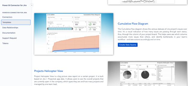
Power BI Connector for Jira also includes a set of ready-to-use templates, further streamlining the Jira reporting process. The Cumulative Flow Diagram template is among these, enabling teams to generate visualizations efficiently without starting from scratch. By leveraging these templates, users can save time and effort while still taking advantage of Power BI’s advanced features and visualizations. Ultimately, the combination of Power BI, Alpha Serve’s Power BI Connector, and the provided templates empower teams to make data-driven decisions, optimize project management, and achieve superior results.
How to Create Jira Cumulative Flow Diagram in Power BI
Creating Jira Cumulative Flow Diagrams with Power BI gives you access to more informative reports fully customizable to your specific needs. It means you can adapt the charts based on your unique data requirements, modify them accordingly and share reports with non-Jira users. Power BI also supports cross-project reporting. It makes it possible for teams that want to generate consolidated CFDs across various projects to improve their project management efforts significantly.
Steps to Create a Jira Cumulative Flow Diagram in Power BI
To start creating a Power BI Jira Cumulative Flow Diagram, ensure you have Jira Cloud Administrator rights and install the Power BI Connector for Jira from Atlassian Marketplace. Then, follow these steps:
Step 1. In Power BI Connector for Jira, go to the Templates tab and select the Cumulative Flow Diagram template and click on the Create Data Source button.
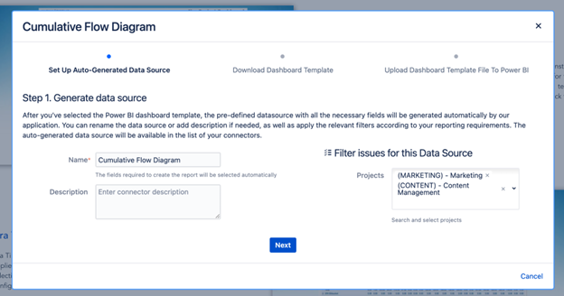
Step 2. Set up the auto-generated data source by providing the name, adding a description, and applying a project filter if needed. Click Next.
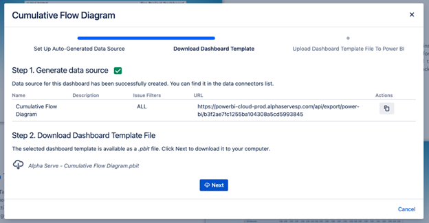
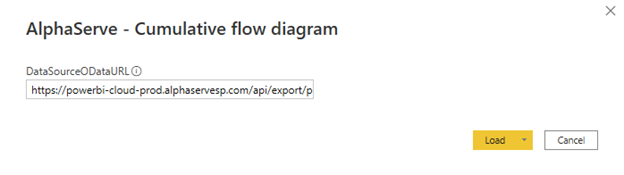
Step 3. Copy the generated Data Source URL and click Next to download the .pbit file.
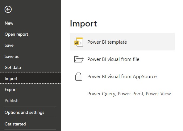
Step 4. Navigate to the File tab in Power BI Desktop and select Import > Power BI template. Choose the .pbit file you previously downloaded and click Open to import the template into Power BI Desktop.
Step 5. Paste the Data Source URL you copied from the Power BI Connector for Jira into the appropriate field in Power BI Desktop.
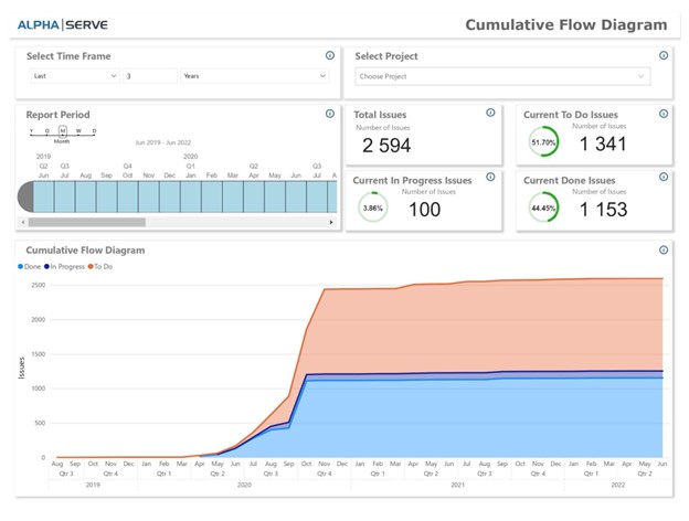
Step 7. After establishing the connection, the Cumulative Flow Diagram will be displayed in Power BI Desktop. You can now customize the visualization by adjusting the settings, filters, and date ranges as needed. Additionally, you can incorporate this visual into existing reports or create new ones by combining it with other visualizations. Save your work and share your insights with your team as required.
Final Words
In conclusion, creating a Jira Cumulative Flow Diagram in Power BI significantly enhances the way teams manage projects and workflows. By leveraging Power BI’s advanced analytical capabilities and seamless integration with Jira, teams can easily visualize the progress of work items and quickly identify potential bottlenecks and disruptions. With this valuable insight, teams can optimize their workflow, make data-driven decisions, and continuously improve their project management efforts.
The step-by-step guide provided in this article simplifies the process of creating a Cumulative Flow Diagram in Power BI, allowing teams to take full advantage of this powerful report. Start incorporating Power BI’s Jira Cumulative Flow Diagram into your project management routine, and witness the transformation in productivity, efficiency, and overall project success.