

An email signup form is used to collect email addresses from your potential customers and leads. These email signup forms are embedded on web pages where people interested in your business can submit their email addresses and a few other details to be added to your email newsletter. As an email marketing specialist, I find them incredibly important because that’s where all your outreach efforts truly begin. Here are the seven things you should do to design email signup forms that turn your visitors into leads.
Make Your Email Sign Up Form Responsive
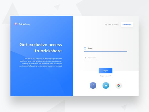
With the growing number of users visiting websites from their mobile phones, It’s in your best interest to use email marketing templates that have an inbuilt form to make sure that your email signup form is responsive. This doesn’t mean making it look good on smartphones. It means that form should not be put in a pop-up that Google might penalize you for, and visitors dislike this just as much too.
Design the email signup form so that it’s large enough to see, but it doesn’t require visitors to scroll down to see the full message or form. Try making inputs intuitive so your subscribers don’t have to change keywords to fill out the fields. The email signup form should perfectly fit in the mobile screens, and the design elements should cause potential visitors to stop and consider the offer.

Position Your Sign Up Form At The Right Place
Don’t try to drive your visitors with pop-up forms, as that will probably interrupt the site experience. Another big mistake is to use a “subscribe” button to lure them to another page to fill your form. Just try to place your signup form right on the page itself. For finding the right location for it, you should entertain two factors – The first one is “Context.” The positioning of your form should be perfect in terms of the context of the webpage.
The second factor to think about when it comes to placement is your visitors’ “reading patterns.” Placing your signup form in the top-right corner of the page makes a lot of sense. Your visitors will start reading at the top-left, go all the way to the far-right before going downwards. If the email signup form doesn’t fit naturally on that page or you don’t have a sidebar, that’s perfectly okay. You just simply need to determine the place on the relevant page where people’s eyes are more likely to stop and take in the content to ensure your form doesn’t get lost.
Pay Attention To Making Your Signup Form Design Attractive
When it comes to design elements on a signup form, all you have to do is consider how much you really need it to stand out. Undoubtedly you don’t want your email signup form to get drowned out by all the content around it. But with this, there is also a need that you don’t overshadow the design with it. You can just simply use a contrasting colour palette to make the form noticeable without being overwhelming. Another nice idea is to make the edges of the form different. Also, the form should not be narrower than the content above or below it.
Consider User Intent
We all know that your website visitors landed on a particular site for a reason. If your offer doesn’t help them meet their needs, they may not feel encouraged to convert. Here is an example to elucidate this point: Let’s assume you have a website that compares your services/product to competitors. The visitors arrived because they want to see how you match up with others in the industry.
But for this, if you offer something like “X Reasons Why They Should Buy Your Products,” it may make you fall flat. As the visitor is already comparing providers, they are already aware of the product’s value. They are just figuring out which provider to go with. In this kind of scenario, the best-suited way to approach this intent is a product demo. You have to consider the intent on your pages and craft offers that match up with that intent.
Buttons Should Be Properly Clickable
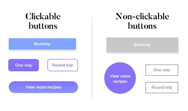
When considering the button design for your signup form, it is necessary to keep in mind the fact that the user may not be aware of your brand’s design language. Thus, focus on making their usage intuitive in terms of clickability and make them clearly distinct. I also recommend against using “Ghost buttons.” Contrast and weight play an important role in projecting a clear difference with the rest of the design elements, so make the best use of these attributes. With that being said, ensure that the white space and button size are appropriately balanced for all screen sizes (mobile responsiveness) and include this in your QA sheet as well.
Entail A Trust Mark At The Bottom
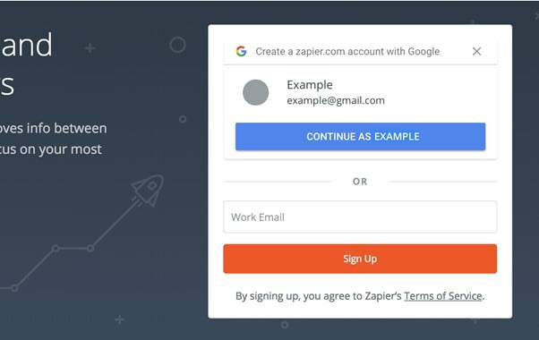
Don’t expect your potential subscribers to go digging through the footer of your website to check on your privacy policy before signing up. If you are not giving them easy access to this information upfront, expect them to have major doubts about moving ahead. There are lots of chances that visitors may abandon website forms because they are concerned about security. Entail a small statement under the form that informs visitors about your privacy policy by including a link to it.
You can also ask visitors to accept your privacy or cookies policy when they enter the site. Another option is to use a checkbox requiring their acknowledgement and acceptance of the privacy and security policies. It does not point visitors to information about how the data is protected, but it also informs them what kind of content to expect in their email inbox. This is a really nice way to ensure that visitors really want to become subscribers and are not going to unsubscribe the second they see a message outside their original expectations.
Test Everything
Lastly, I would like to stress the fact that you will be required to aggressively test your email signup forms for different platforms and target audiences. The possibilities for optimization are quite broad since small changes like the colour of different elements can make significant differences in the outcome. On the other hand, it will also allow you to learn more about your target audience in terms of what prompts and interests them. You can also employ A/B Split testing to find the optimal balance between your email signup form’s various elements.
Wrap Up
Email marketing is one of the best ways to create a steady revenue flow, and the signup form acts as an entry gate to your sales funnel. Use these tips to design appealing email signup forms, and as an email marketing specialist myself, I find that these tips will also help refine your lead quality. I hope you find this article on email signup forms insightful.
Author: Kevin George is Head of Marketing at Email Uppers, one of the fastest-growing custom email design and coding companies, and specializes in crafting professional email templates, PSD to HTML email conversion and free HTML email templates. He loves gadgets, bikes, jazz and eats and breathes email marketing. He enjoys sharing his insights and thoughts on email marketing best practices on his blog.
Check out: TOP SEO Tips For Organic Ranking Boost